Skip to content

Case study · SAI

Brand evolution and digital presence

The work with SAI, a manufacturer and distributor of orthopedic implants, began in 2013, before Audacher existed, and has already gone through three versions of its website. The latest one changed what the company communicates: less about the factory and more about what matters to the physician.

  • Type of workStrategy, content, and web development
  • IndustryOrthopedics and trauma
  • Versions2016 · 2021 · 2026

The starting point

SAI talked about products and the factory. Nothing else.

People saw another product, and that was the end of the conversation. The 2016 site had been growing on the same foundation for eight years: every change depended on a developer, medical education had no place on the site, and anyone searching Google for a product landed on a PDF.

SAI manufactures and distributes implants and instruments for orthopedic and trauma surgery. When it asked us for advice, almost everything it communicated was about products and the factory: launches, lines, codes. Healthcare professionals saw another product, and the conversation ended there.

Meanwhile, the company was already training physicians through courses and workshops, displayed registrations from nine regulatory authorities, and had a catalog of nearly 270 products whose information was spread across Engineering's technical data sheets, congress presentations, and Medical Affairs' judgment. On the website, none of that was written as content.

A surgeon searching for “retrograde tibial nail” landed on a catalog PDF, without the IFU, registration information, or the rest of the line alongside. To find a code or compare two sizes, they called.

What we found

  • PDF catalogs instead of product pages
  • Technical content that hadn't been written
  • Medical education without a place of its own
  • Changes that depended on a developer

The approach

A digital structure focused on the target audience.

Before designing a single screen, we developed the value proposition, narrative, and five communication territories for a company serving the medical industry. With that in order, each team knew what to talk about and the website began to take shape.

The first step was understanding the company across all its teams: a meeting with the leads from Product, Customer Service, Medical Education, Events, and Corporate, followed by a separate workstream with each one.

That produced a value proposition that shifts the focus from the factory to SAI's services and global outlook, and a narrative that gives it context. Communication was organized into five territories (Education & Knowledge, Products & Solutions, Innovation & Growth, Customer Experience & Support, and Community & Engagement) so each team can produce content without the company sounding different depending on who writes.

Only then did we model the catalog: four content types, a 106-field product page, and five navigation dimensions with 86 terms, so a product can be found by code, brand, anatomical region, or procedure and always end up on the same product page, with its documentation next to it.
What we did

  • Value proposition
  • Narrative
  • Five communication territories
  • Content architecture
  • 106-field product page
  • Bilingual website
  • Launch communication
  • Migration without losing search rankings

The hardest part

Writing what had never been written

The knowledge existed, but it lived in people's heads. Each piece of copy was written with the team that knew the subject and validated by the right person before design, and the validation workflow was left in place for products added later.

We also had to migrate without breaking anything: the previous site had URLs people had saved and that Google already knew. We audited 511 redirects through to their final destination, none were broken, and we fixed 1,065 internal links across 302 pages that still pointed to the site itself with http:// instead of https://.

The versions of the website

Four websites for a company that kept growing

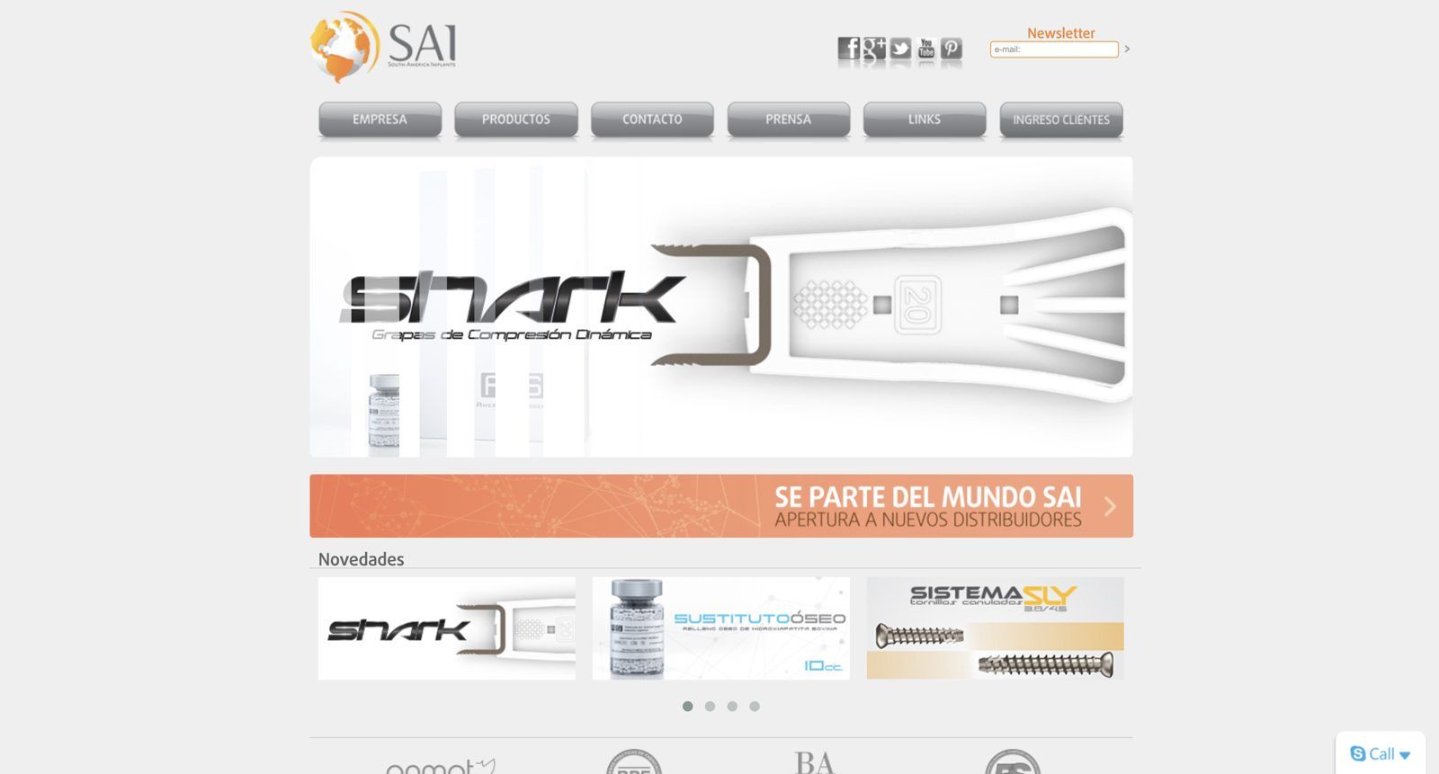
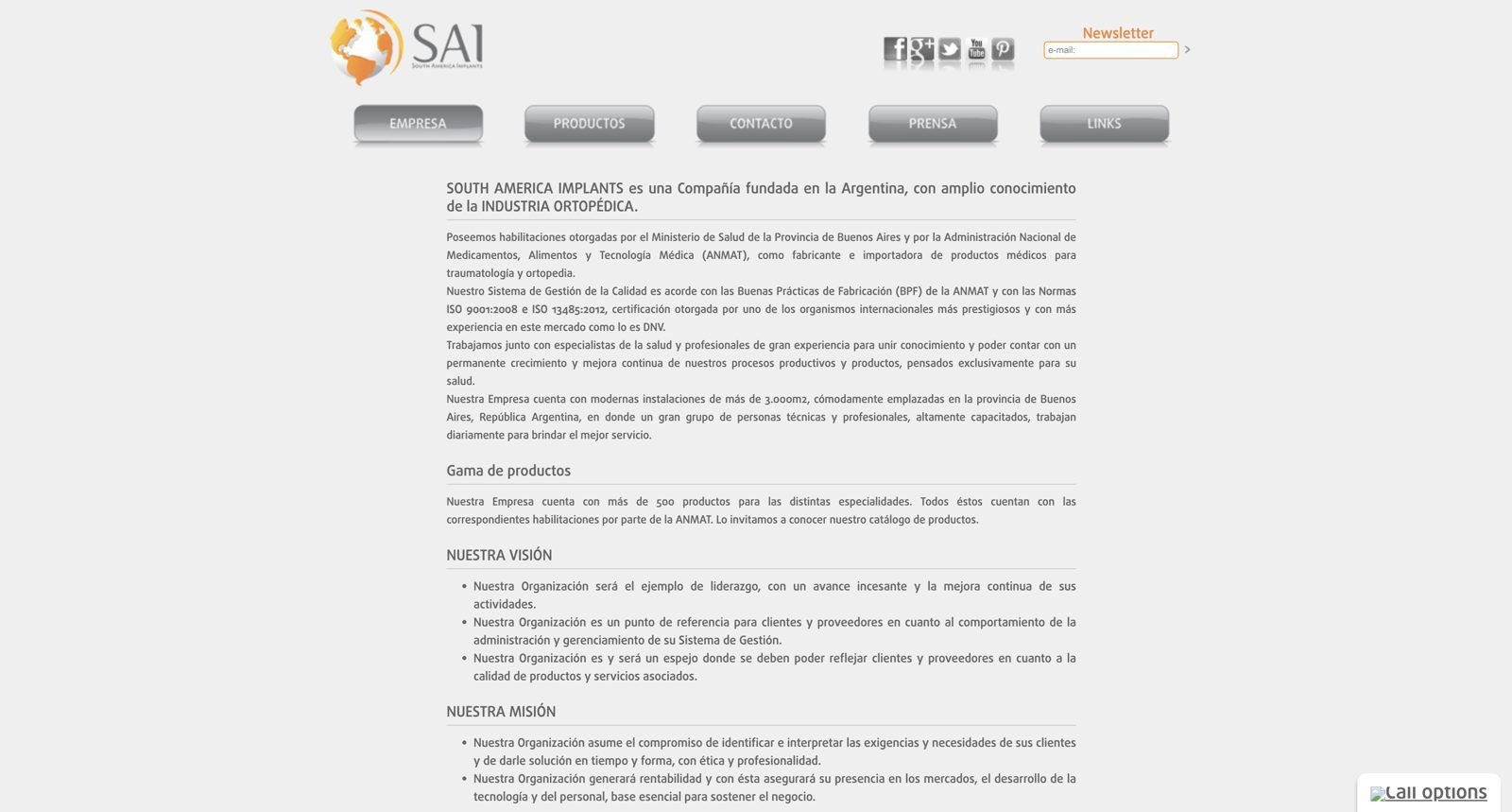
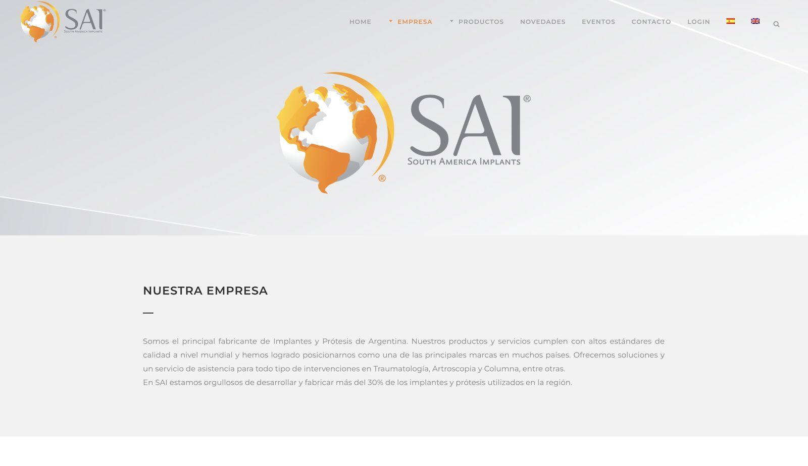
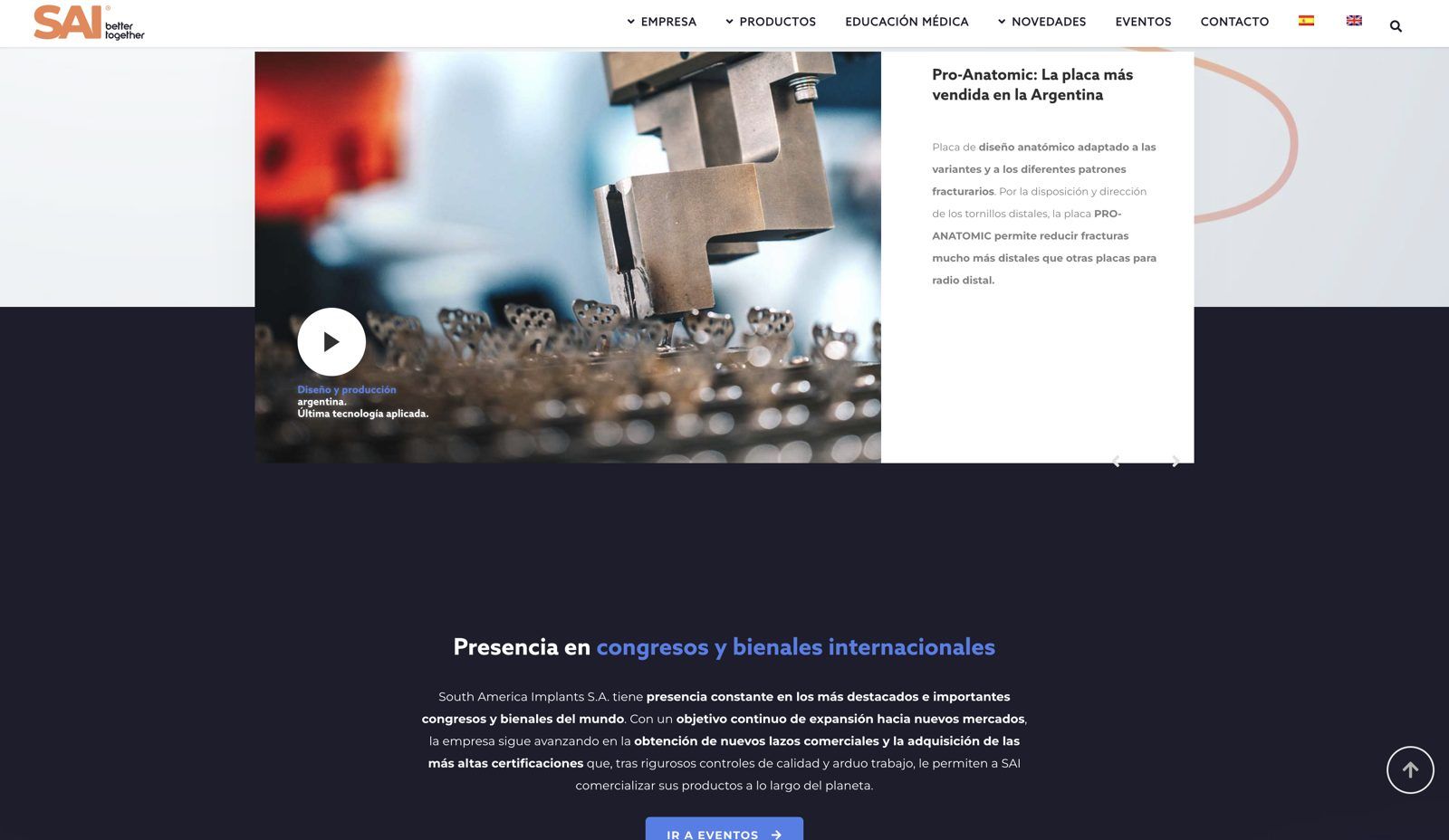
2013

The website SAI already had

What was happening at SAI
We started working with SAI. The first projects were a general marketing report, updated printed materials, and the company's presence at congresses.
What we found
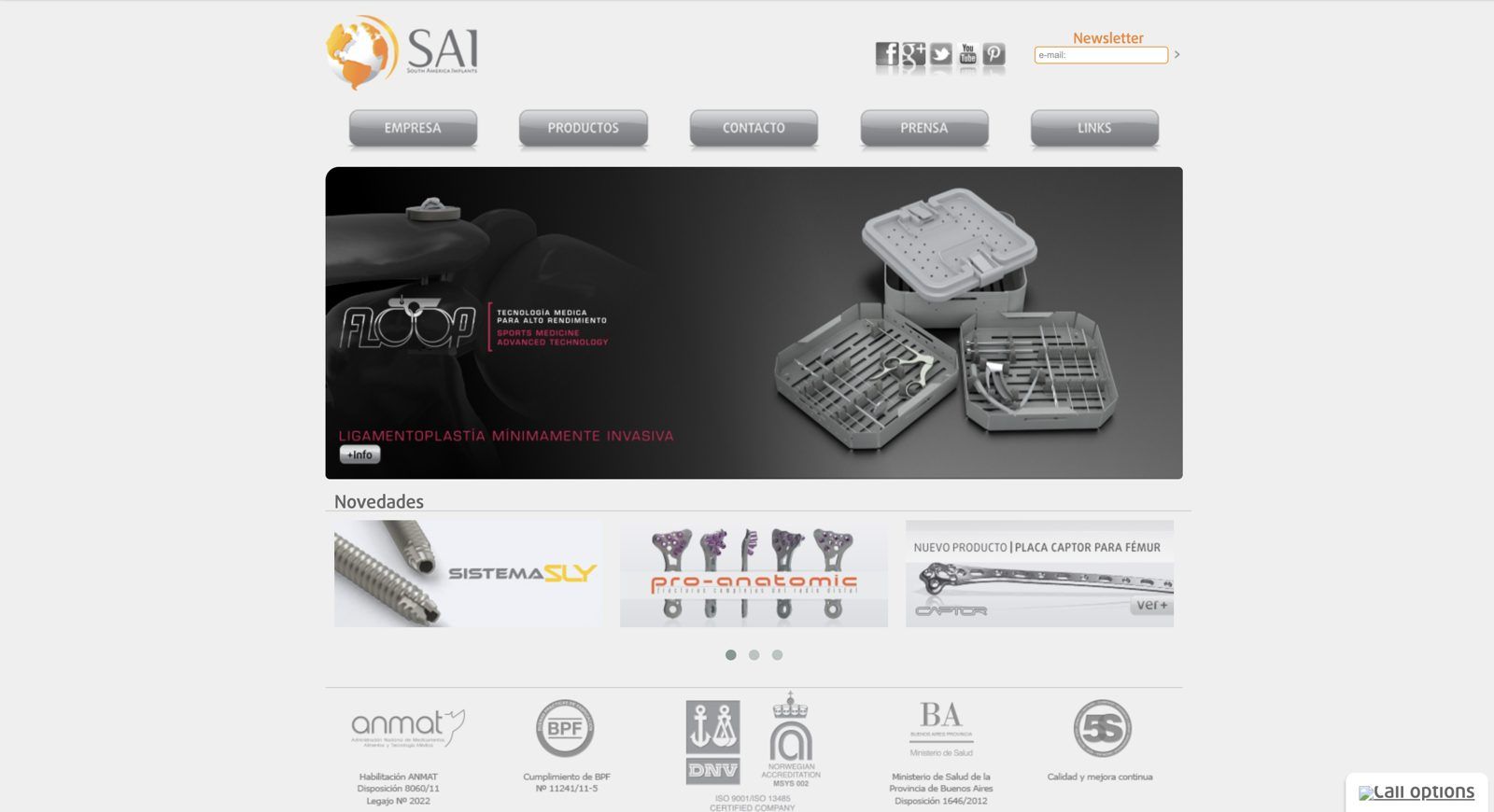
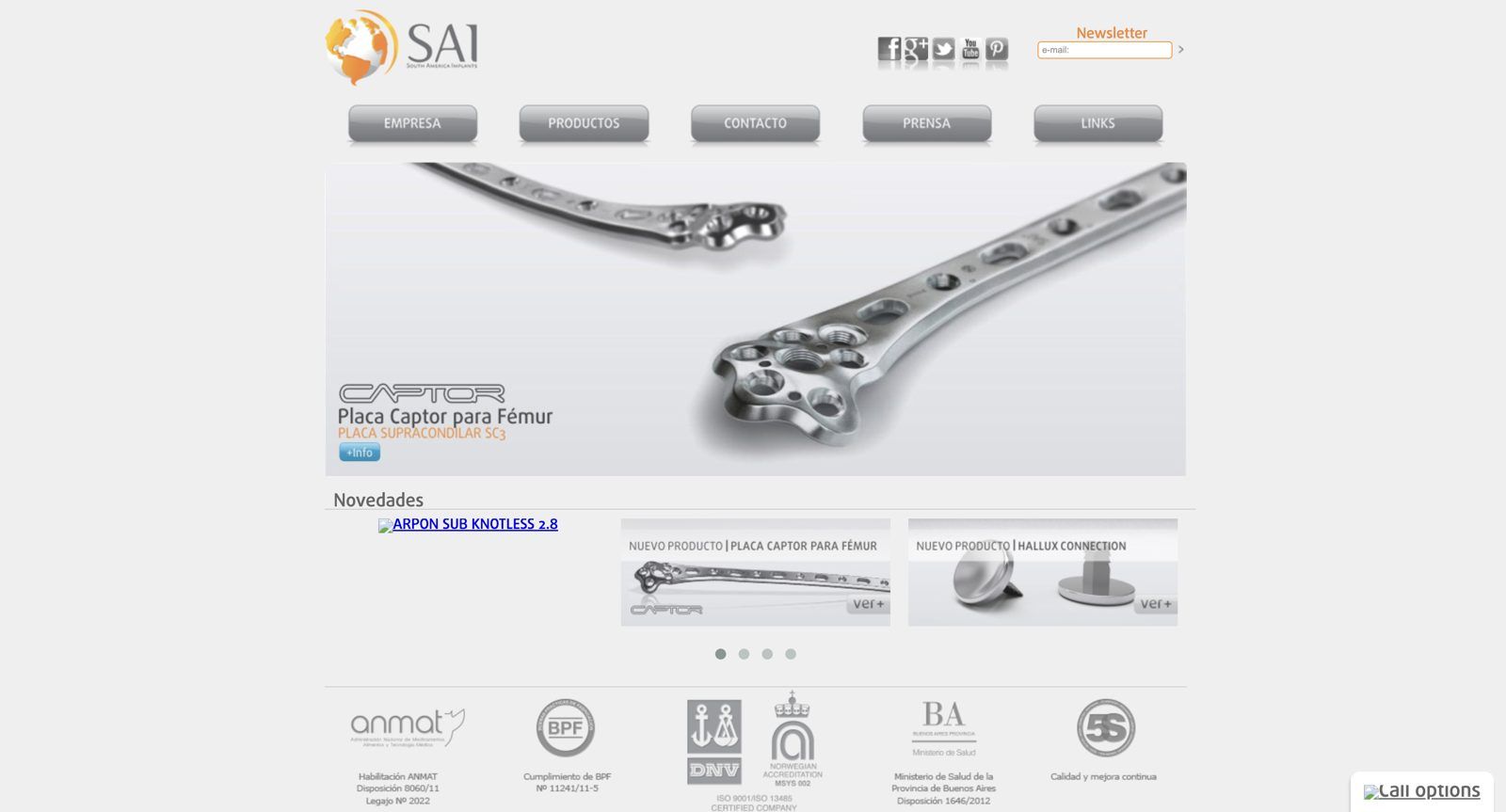
We found a website that looked dated even for its time: embossed buttons, a carousel, and the certifications in the footer.

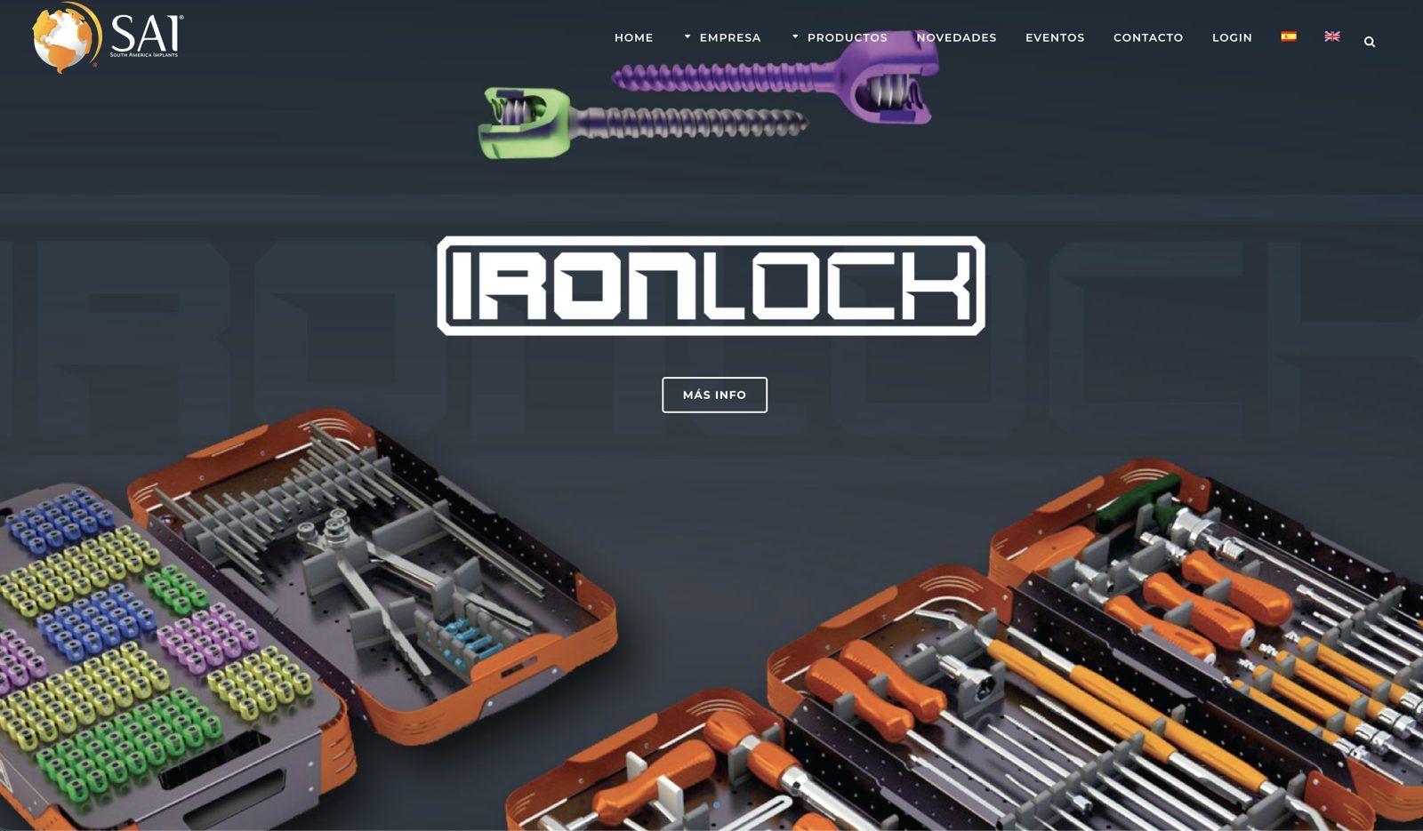
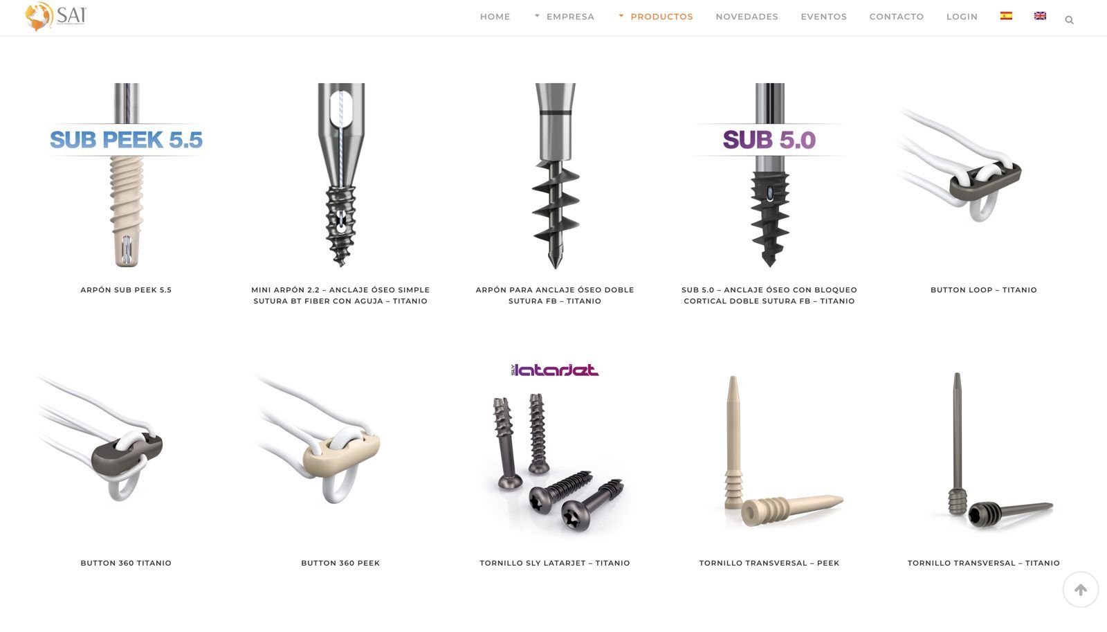
2016

The first WordPress website

What was happening at SAI
The company had no copy and no structured communication.
What we did
We built a modern, mobile-friendly website using the content that already existed: bilingual, with events, customer access, and a product grid.

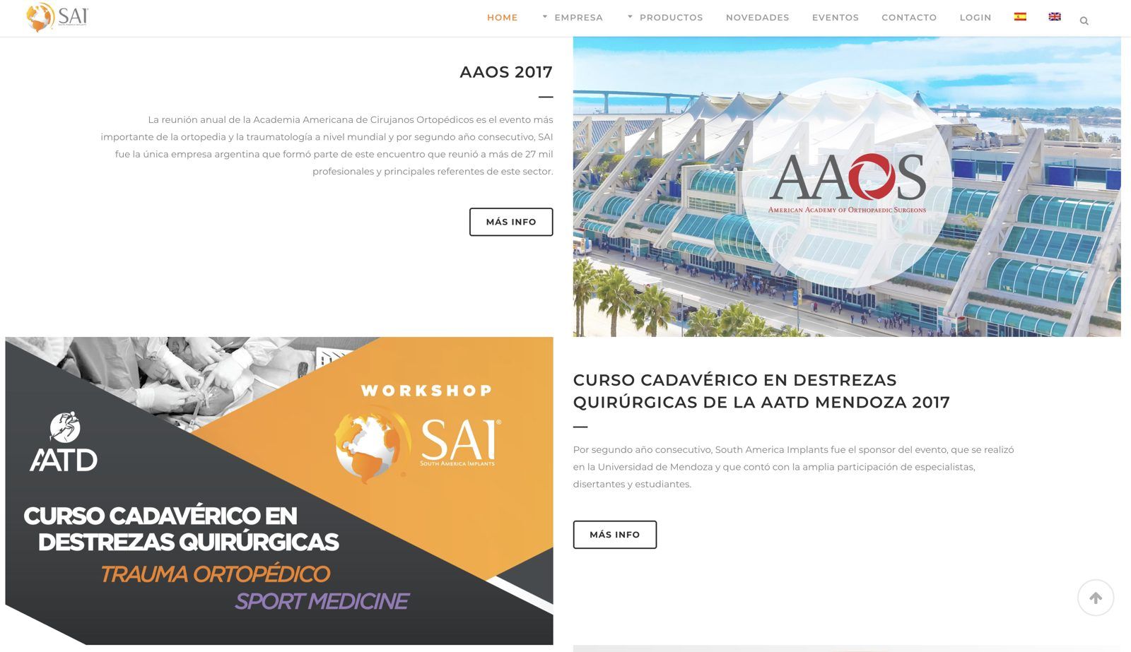
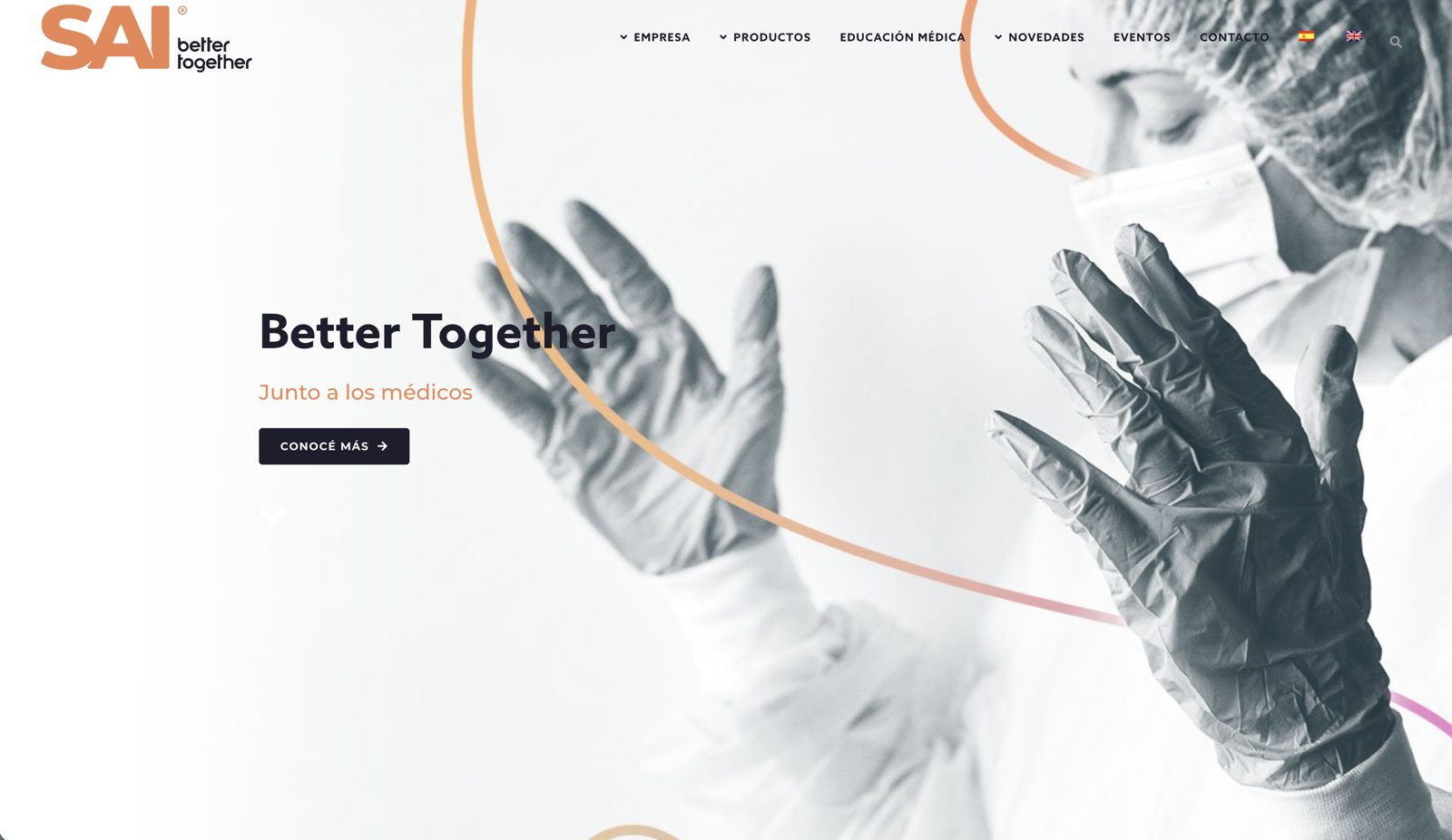
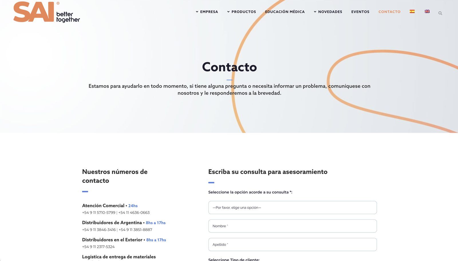
2021

The new brand on the same foundation

What was happening at SAI
SAI launched a new brand and needed to show its values, its events, and more complete product pages.
What we did
We applied the brand to the 2016 website and added the manifesto and new pages. Medical education was added to the menu, and contact options were organized by team.

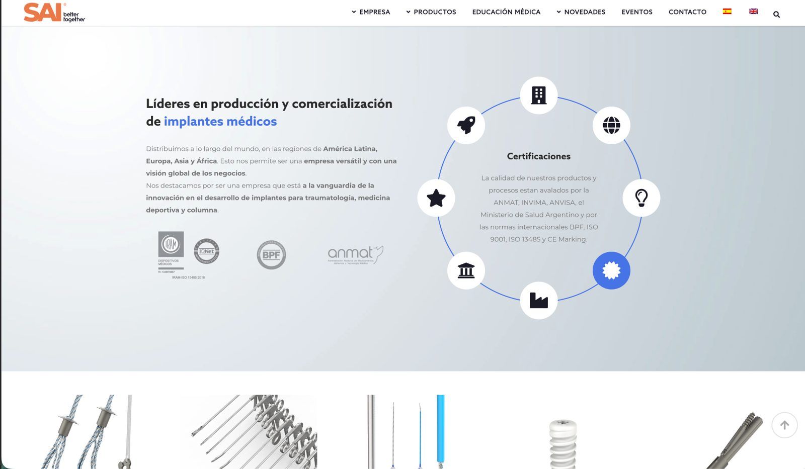
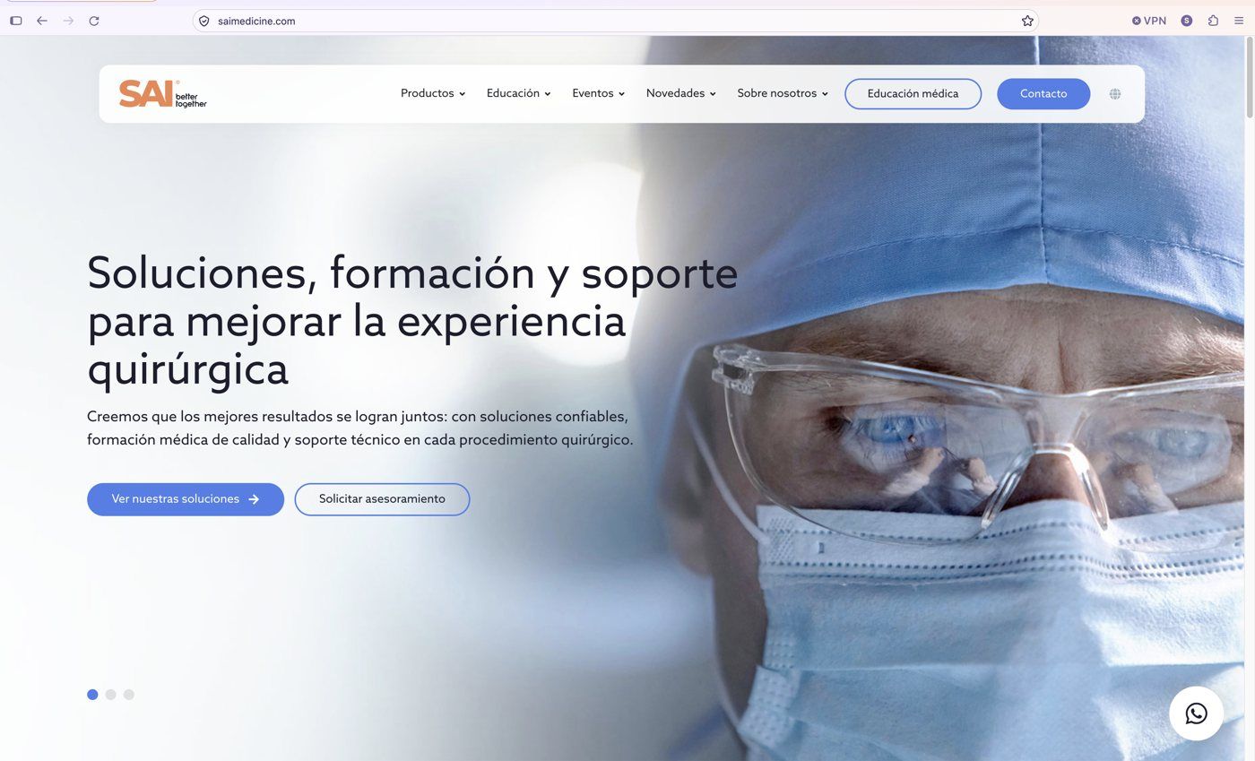
2026

A website that matches the company

What was happening at SAI
The website was eight years old, every change depended on a developer, and almost everything it communicated was about products and the factory. The company had changed: from about 100 to more than 600 employees.
What we did
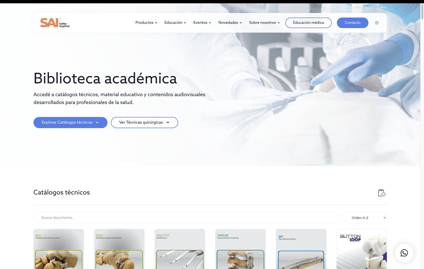
Value proposition, narrative, and territories before design. Then the filtered catalog, the product pages with their documentation, and medical education with courses and a library.

2013

The website SAI already had

What was happening at SAI
We started working with SAI. The first projects were a general marketing report, updated printed materials, and the company's presence at congresses.
What we found
We found a website that looked dated even for its time: embossed buttons, a carousel, and the certifications in the footer.

2016

The first WordPress website

What was happening at SAI
The company had no copy and no structured communication.
What we did
We built a modern, mobile-friendly website using the content that already existed: bilingual, with events, customer access, and a product grid.

2021

The new brand on the same foundation

What was happening at SAI
SAI launched a new brand and needed to show its values, its events, and more complete product pages.
What we did
We applied the brand to the 2016 website and added the manifesto and new pages. Medical education was added to the menu, and contact options were organized by team.

2026

A website that matches the company

What was happening at SAI
The website was eight years old, every change depended on a developer, and almost everything it communicated was about products and the factory. The company had changed: from about 100 to more than 600 employees.
What we did
Value proposition, narrative, and territories before design. Then the filtered catalog, the product pages with their documentation, and medical education with courses and a library.

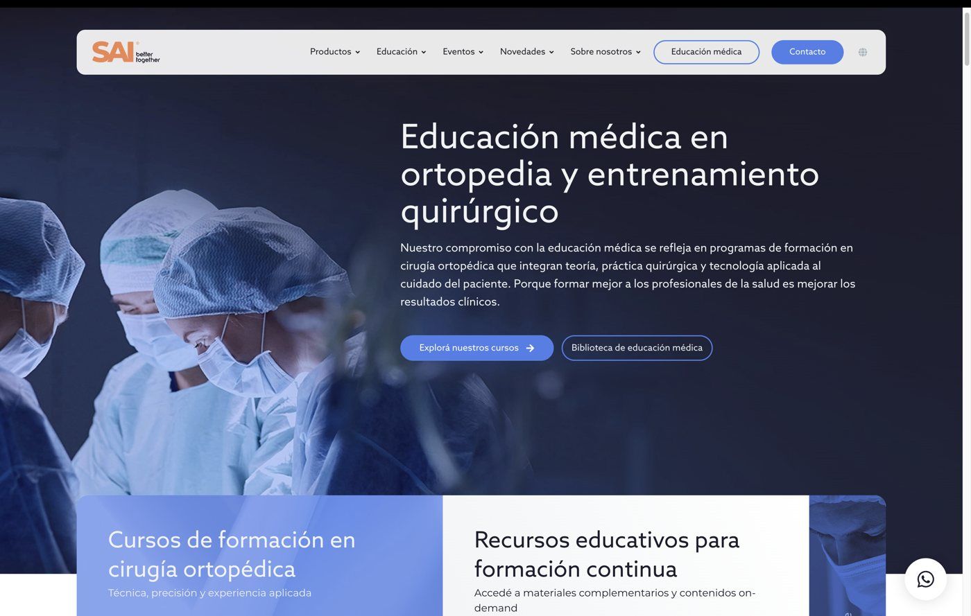
The new website

The whole website, page by page

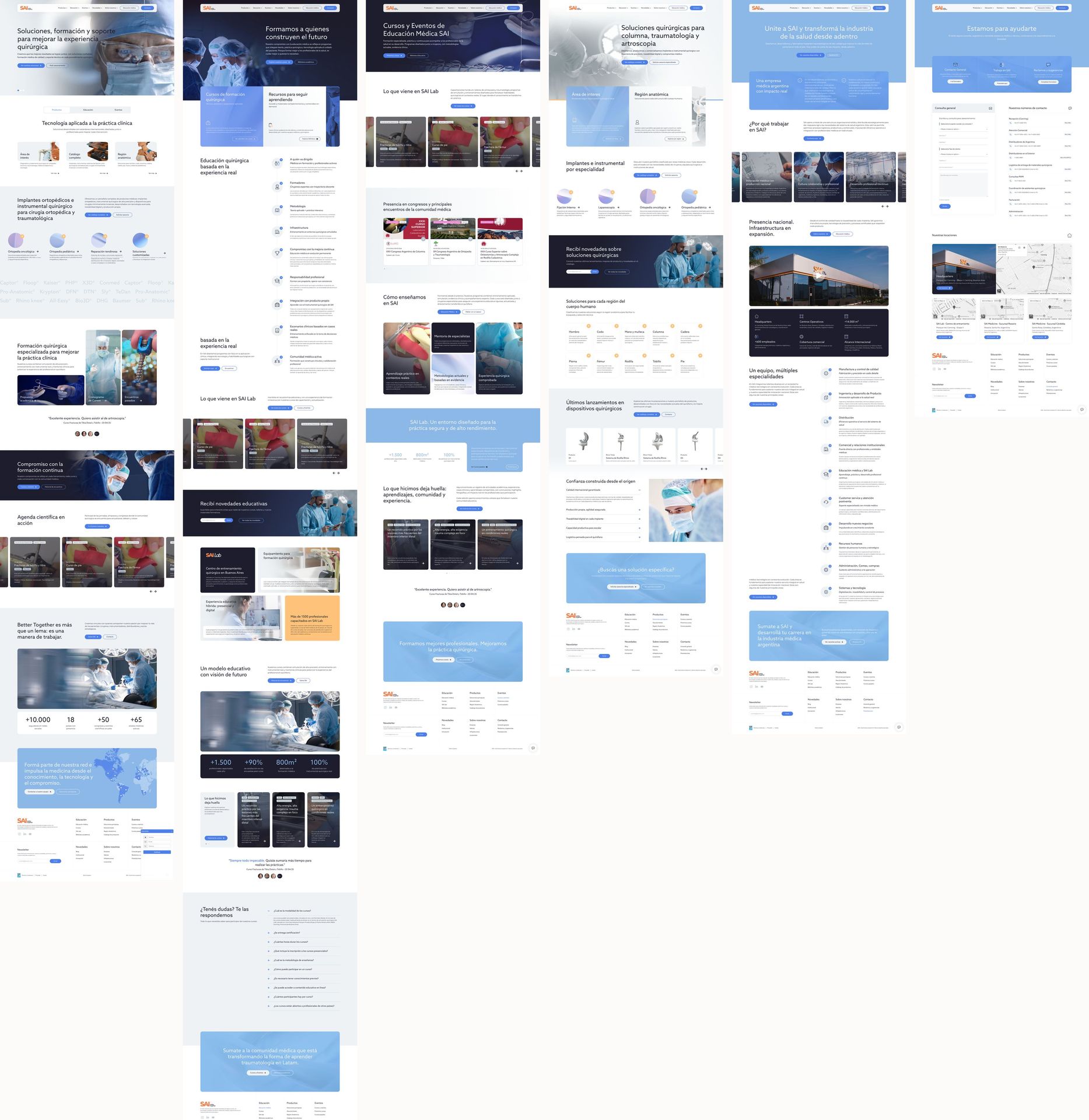
Six pages of SAI's new website side by side: home, medical education, courses and events, surgical solutions, careers at SAI, and contact.
Home, medical education, courses and events, surgical solutions, careers at SAI, and contact.

What happened after the launch

  • 1,3083,227clicks on product pages
  • 348577product pages with traffic
  • 8,23812,817organic sessions
  • 1,396people downloaded documentation

Services applied in this case study

Products, training, and content, now on one website.