Paths by audience
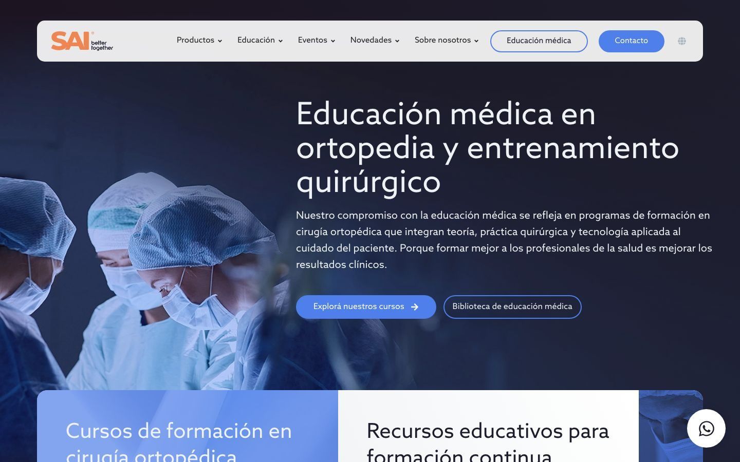
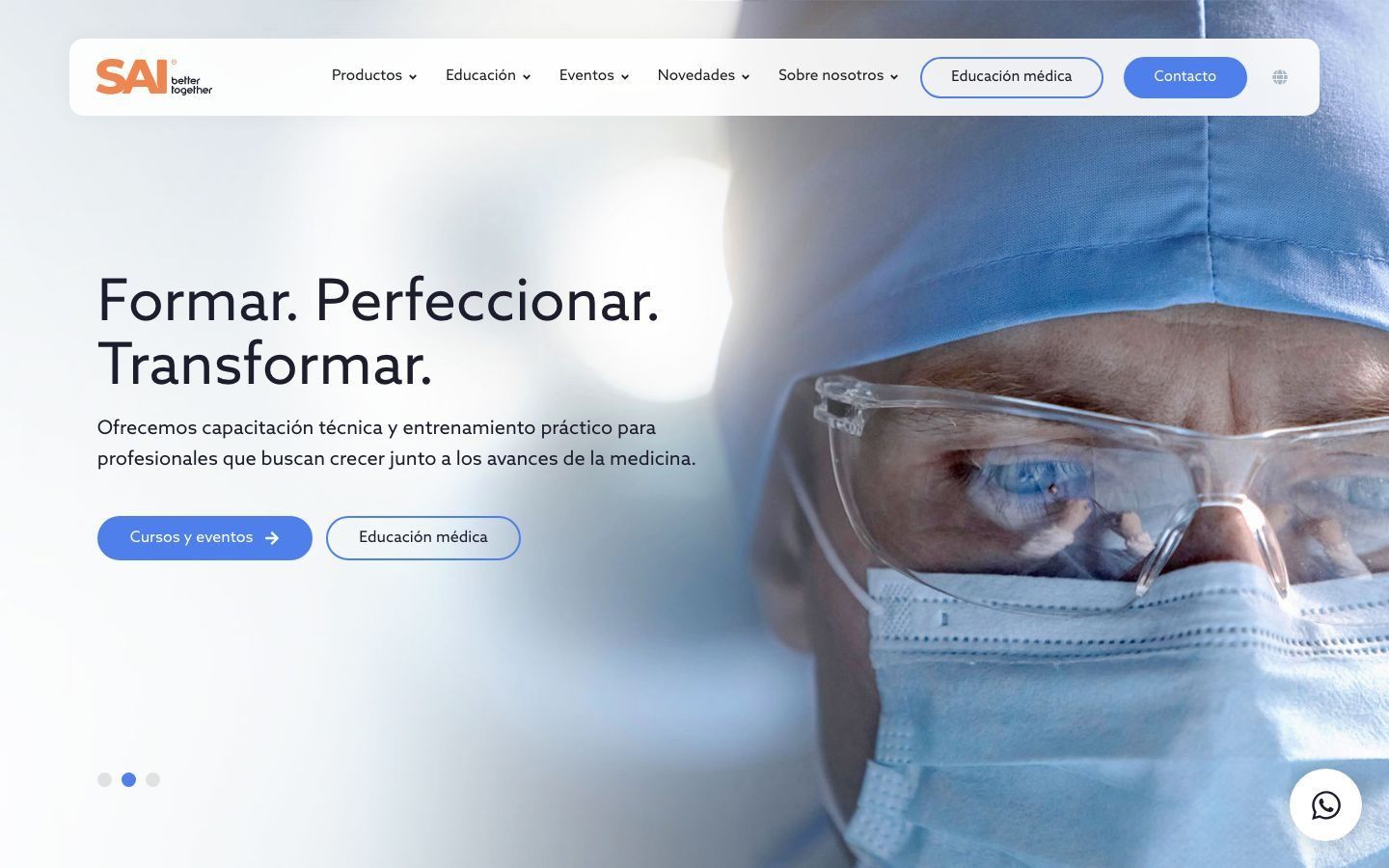
We define paths based on who is using the site and what they need: a healthcare professional, a distributor, or a patient.
Creativity · Strategy · Development · Impact
Services › Web design and development › UX/UI design
We design paths, pages, and components using real content, with the structure already defined and the concrete needs of the people who will use the site.
The work connects architecture, visual hierarchy, responsive design, and behavior so that product pages, catalogs, documents, and content areas can grow without forcing the interface to improvise every time.
The interface has to hold up under real content.
We define paths based on who is using the site and what they need: a healthcare professional, a distributor, or a patient.
We organize hierarchy, navigation, and content with real material before getting into visual detail.
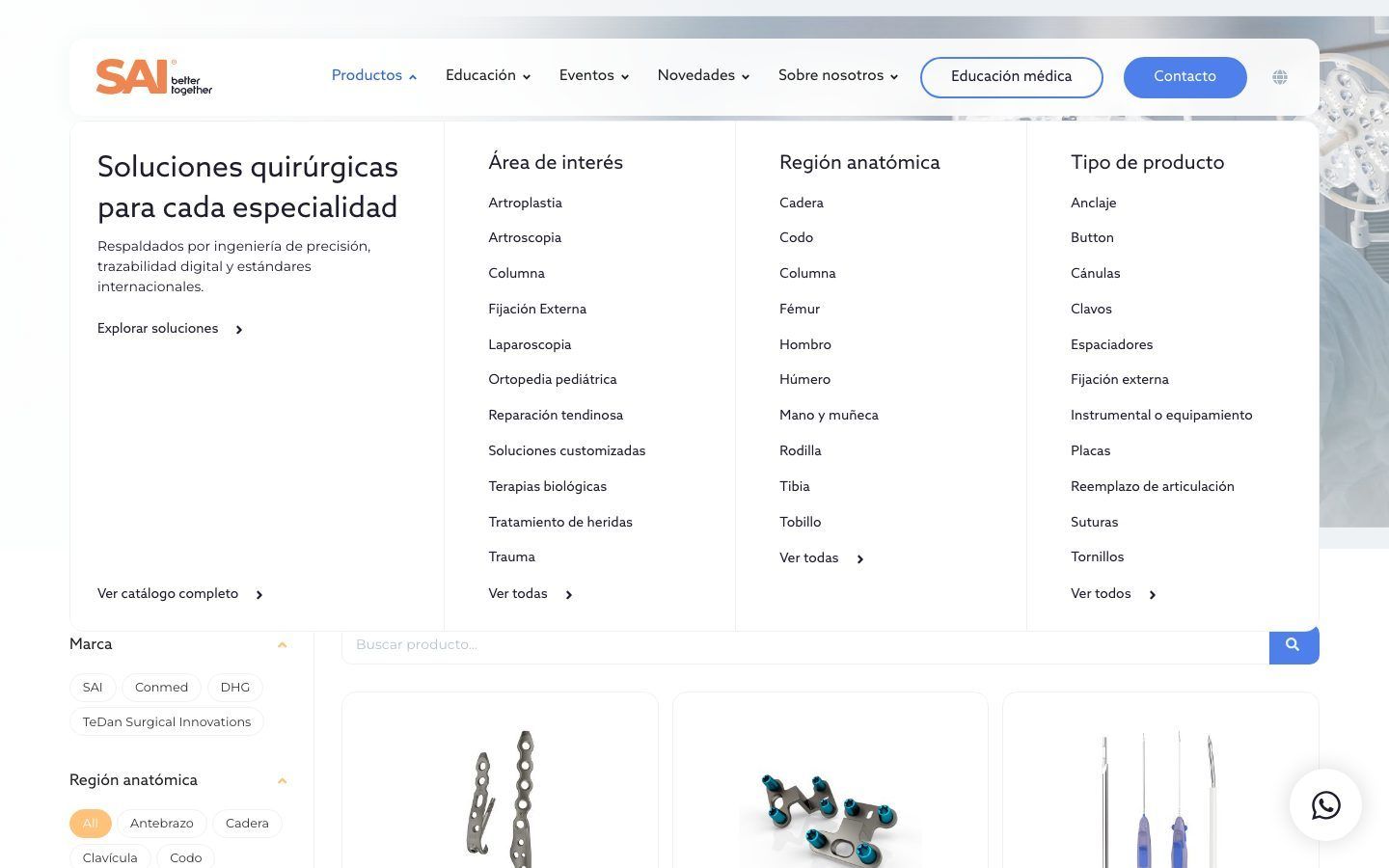
We design reusable components for product pages, listings, filters, and courses, each with a clear function.
We organize tables, variants, downloads, and related products so the main information someone is looking for remains clear.
The mobile experience is part of the design from the start, because people often look up information on a phone.
We review structure, contrast, navigation, and components against accessibility criteria, and they're validated again in development.
How it's designed
We review how each audience searches and which content types they need to move through to complete a task.
We turn the architecture into wireframes and page hierarchies.
We first test whether the content fits, is easy to understand, and can be navigated.
With the structure approved, we add visual design, components, states, and responsive behavior.
The exploration can include different variants; the final decision is made with the client based on concrete needs.
We test screens with edge-case content, different devices, and real situations before handing them to development.
Whatever comes up during implementation goes back to design when the reality of the build requires a decision to change.
Work · SAI
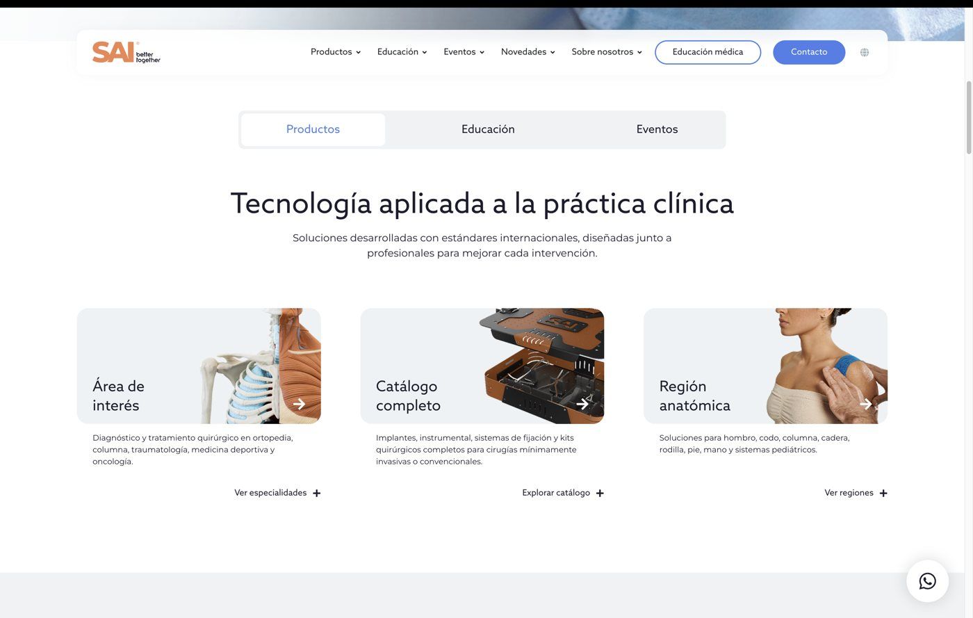
At SAI, the previous catalog worked better for people who already knew which product they were looking for. The new experience also had to welcome people arriving through an anatomical region, a procedure, or a surgical need.
The structure and the paths, yes, while the copy is being written. The final visual design is best done on real copy: it's the only way to know whether the product page and the size table fit.
Not necessarily. If the brand works, the design translates it to the web. If it needs to evolve, that's brand positioning work, and it's better done first.
With different paths, tone, and visual cues. The company and its regulatory team define what is intended for healthcare professionals and how access should work; the design makes that distinction easy to understand.
Yes, from the first wireframe. A product page that falls apart on a phone is only half done.